
First Responders Credit Union
Built for the people who show up first.
Rooted in serving Boston firefighters since 1947, the credit union was expanding to represent first responders across the state of Massachusetts. I helped clarify its future direction and build a more inclusive, recognizable brand system that honored its history while connecting with employees, members, and communities statewide.
Rebrand + Brand Reset / Brand Strategy / Identity Design / Creative Direction
Keep the credibility. Expand the meaning.
The work preserved the credit union’s history while identifying what made it valuable and building a brand capable of carrying that legacy into a broader future. The new identity connected the organization’s purpose more clearly to the people it serves, giving leadership a stronger platform for growth and marketing a more disciplined system for expressing it.
From:
A brand rooted primarily in one profession.
A legacy identity carrying years of history and recognition.
Marketing that needed to work harder to create consistency.
To:
A brand built to represent the broader first responder community.
A clearer expression of the organization’s purpose and future.
A flexible system for consistency everywhere.
Visual Identity
Designed to feel dependable before it feels decorative.
Alignment
A structured grid based on the dimensions of a single design element creates order, consistency, and discipline when applied across the visual identity.
Color Palette
A Massachusetts-inspired palette gives the brand a strong sense of place while moving beyond the expected visual language of emergency services.
Typography
A clear typographic hierarchy keeps communications direct, useful, and recognizable across everything from everyday member materials to major brand moments.
One identity. A lot of ways to show up.
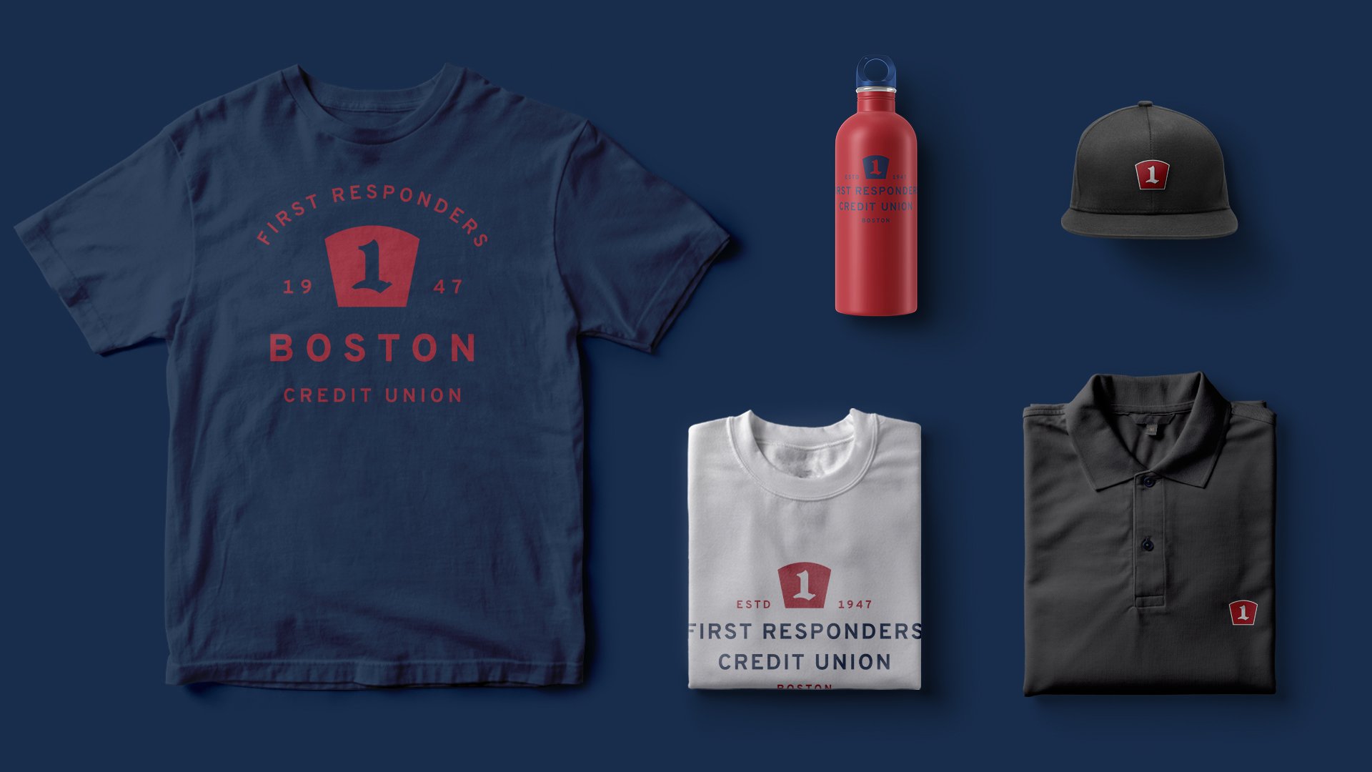
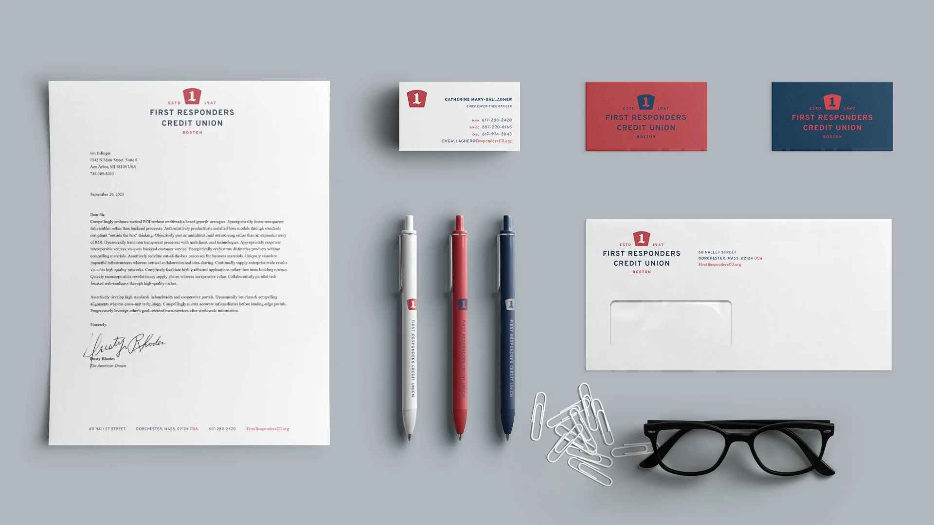
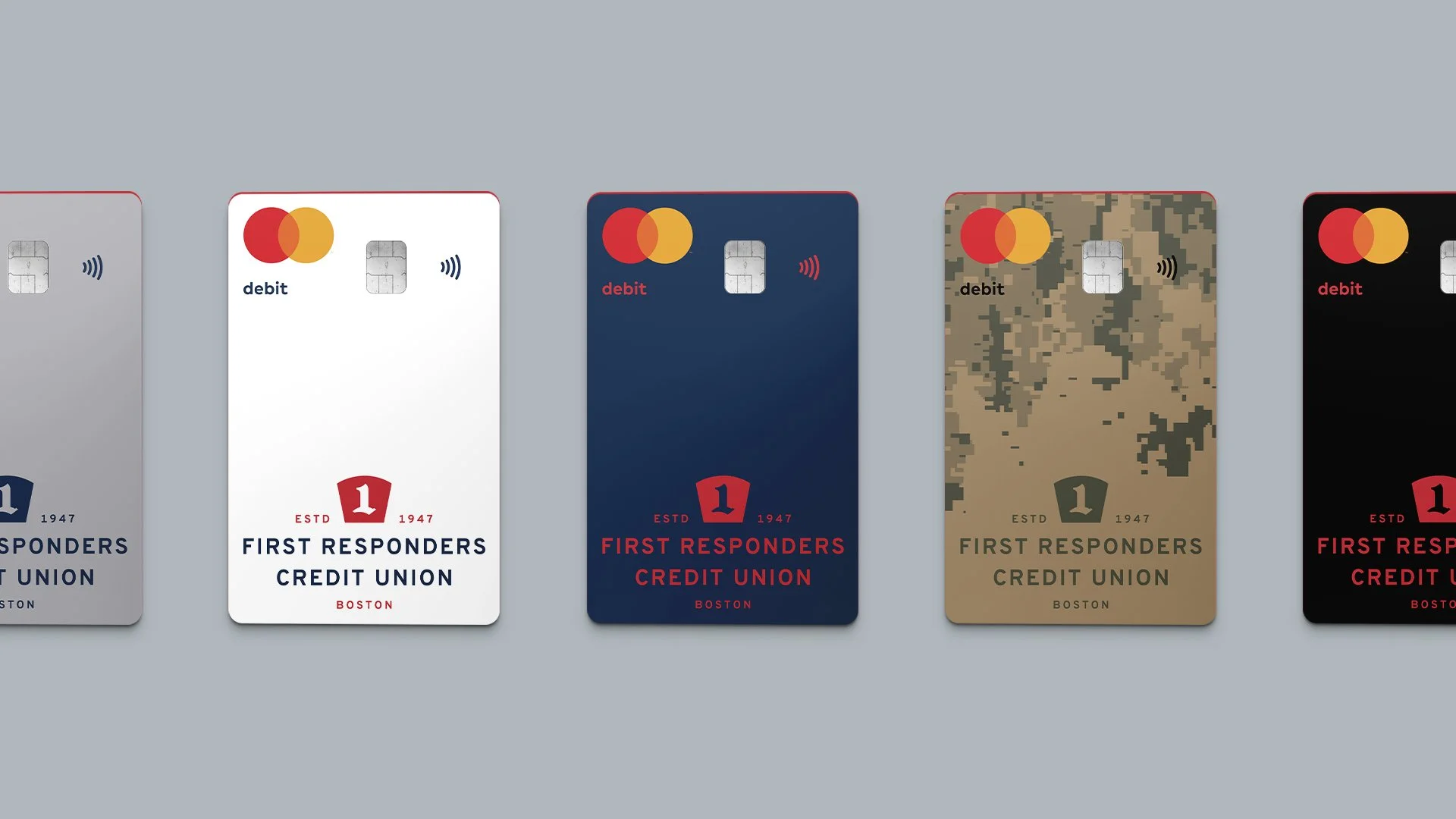
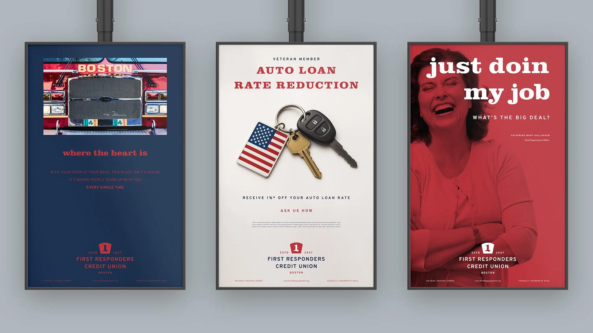
The visual language brings the First Responders Credit Union brand strategy to life through a disciplined system of messaging, alignment, color, typography, and imagery. It gives the marketing team a recognizable framework for member communications, digital platforms, campaigns, events, internal materials, and statewide outreach, flexible in format but consistent in identity.


Jon gets to the heart of what matters to brands and their followers. He helps clients see new ways of connecting. Above all, Jon shows clients something more than they ever imagined.
”
Danielle Milner
President & CEO / First Responders Credit Union
If your credit union has outgrown its brand, let’s talk.
A rebrand should do more than change how the organization looks. It should give leadership clearer direction, help employees believe in where they are going, and make the credit union more relevant to the people it wants to serve.